In brief: Matte lamination reduces glare and gives playing cards a softer, premium look; gloss lamination increases shine and color contrast and is easier to wipe clean. The better finish depends on artwork, handling and target market.
Lamination affects how a playing card looks, feels and resists handling. Buyers often choose matte or gloss based only on appearance, but the better choice depends on artwork style, target market and how the deck will be used.
What matte lamination does well
Matte lamination gives cards a softer, less reflective surface. It is popular for modern brand projects, premium gift decks and artwork that should feel refined rather than shiny.
- Reduces strong reflection under light
- Creates a premium and understated look
- Works well with dark or elegant artwork
- Can pair with spot UV for contrast effects
Matte surfaces can make colors look slightly softer. Buyers with very bright artwork should consider this when reviewing samples.
When gloss lamination is useful
Gloss lamination makes colors appear brighter and more vivid. It is suitable for promotional decks, photo-based artwork, lively event designs and projects where visual impact is more important than a soft-touch feel.
- Brighter color impression
- Good for photo-heavy designs
- Clear promotional look for giveaways
- Often easy to explain to non-technical buyers
Special finishes should support the design
Foil stamping, spot UV and edge finishing can improve perceived value, but they should not be added randomly. A small foil logo or UV highlight can look more professional than overusing special effects on every surface.
For bulk custom playing card projects, decide the base lamination first, then add special finishes only where they support the brand or retail value.
Buyer FAQ
Is matte or gloss more expensive?
The difference depends on the factory setup and selected material. The quote should show finish options clearly before PI confirmation.
Can matte and spot UV be used together?
Yes. Matte lamination with spot UV can create a strong contrast effect on logos, patterns or selected artwork areas.
For a reviewed quotation, send your project brief with the card count, order quantity, size, stock, finish and packaging. You can also ask a short question before the details are final.
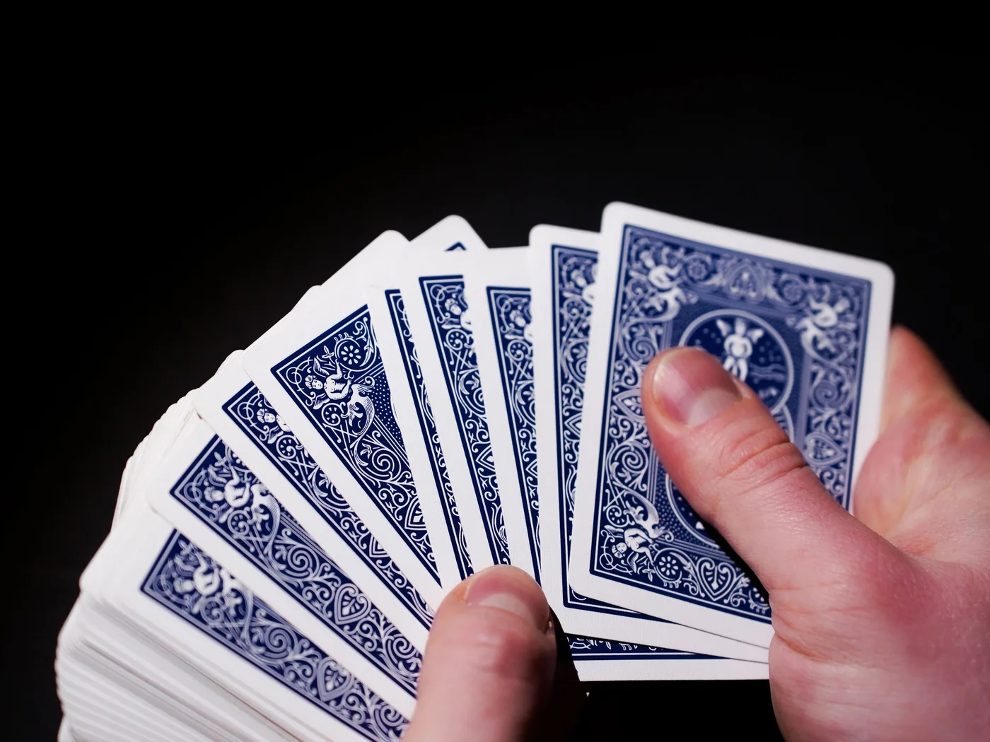
Matte and gloss comparison
| Color appearance | Matte: restrained | Gloss: higher contrast |
| Reflections | Matte: lower glare | Gloss: more reflective |
| Handling | Matte: controlled feel | Gloss: smoother surface |
| Typical use | Premium or design-led decks | Promotional and vivid artwork |
Practical procurement notes
Finish choice should be evaluated on a complete deck, not only a single printed card. Surface friction affects dealing and shuffling, while the combined coating changes the thickness and stiffness of the stack. Matte can make dark designs feel refined and easier to photograph, but gloss can strengthen saturation and contrast for bright promotional artwork.
Fingerprints, scuffing and edge behavior also matter. A dark solid background may reveal marks differently under each finish. Ask for samples that use similar ink coverage to your design and test them under direct light. If the deck will be handled frequently, bend and shuffle the sample rather than judging it only by appearance.
Compare the card options and request a physical material reference. Specify the precise finish and whether it applies to the cards, box or both. Ask for any price difference to be identified in the reviewed quotation.
For artwork that will be photographed or displayed under spotlights, test glare at several viewing angles. Gloss may look vivid straight on but produce reflections on camera, while matte can preserve readability yet soften very dark colors. Aqueous varnish or specialist playing-card varnish may offer a different handling balance from film lamination, so ask which process the quote actually includes. Record the approved sample and finish name in the PI; the word “matte” alone can refer to different materials and surface friction levels at different suppliers. When two finishes are both acceptable, compare them with the same artwork and card stock rather than samples from unrelated decks. This isolates the finish as the main variable and makes the handling comparison meaningful. Ask the supplier to label each sample and retain one approved reference for incoming inspection.
Buyer guidance from Max Deck Print. Final specifications and commercial terms are confirmed for each project.
Updated 6 September 2026: enquiry instructions now follow manual project quotation.
Matte finish does not identify a single process
Varnish, film lamination and a textured surface describe different parts of the specification. Do not approve a quotation that says only matte if the coating method matters to your product. Ask the supplier to identify the process on the cards and the process on the box separately.
A texture does not identify the paper core. For example, BoardGamesMaker documents a blue-core linen stock; this illustrates why texture and core should be specified separately, not treated as interchangeable names. It is a technical reference, not a statement that Max Deck Print supplies that proprietary stock.
For combined foil, spot UV and edge effects on original sets, see the collectible card specification guide. Request an actual finished sample when surface feel or reflection will affect use.